THE BIG BOLD COLOUR THEORY – ARTIST JOHN BOOTH'S SECOND COLLABORATION - LIMITED EDITION COLLECTION OF BLANKETS
THE BIG BOLD COLOUR THEORY – ARTIST JOHN BOOTH'S SECOND COLLABORATION - LIMITED EDITION COLLECTION OF BLANKETS
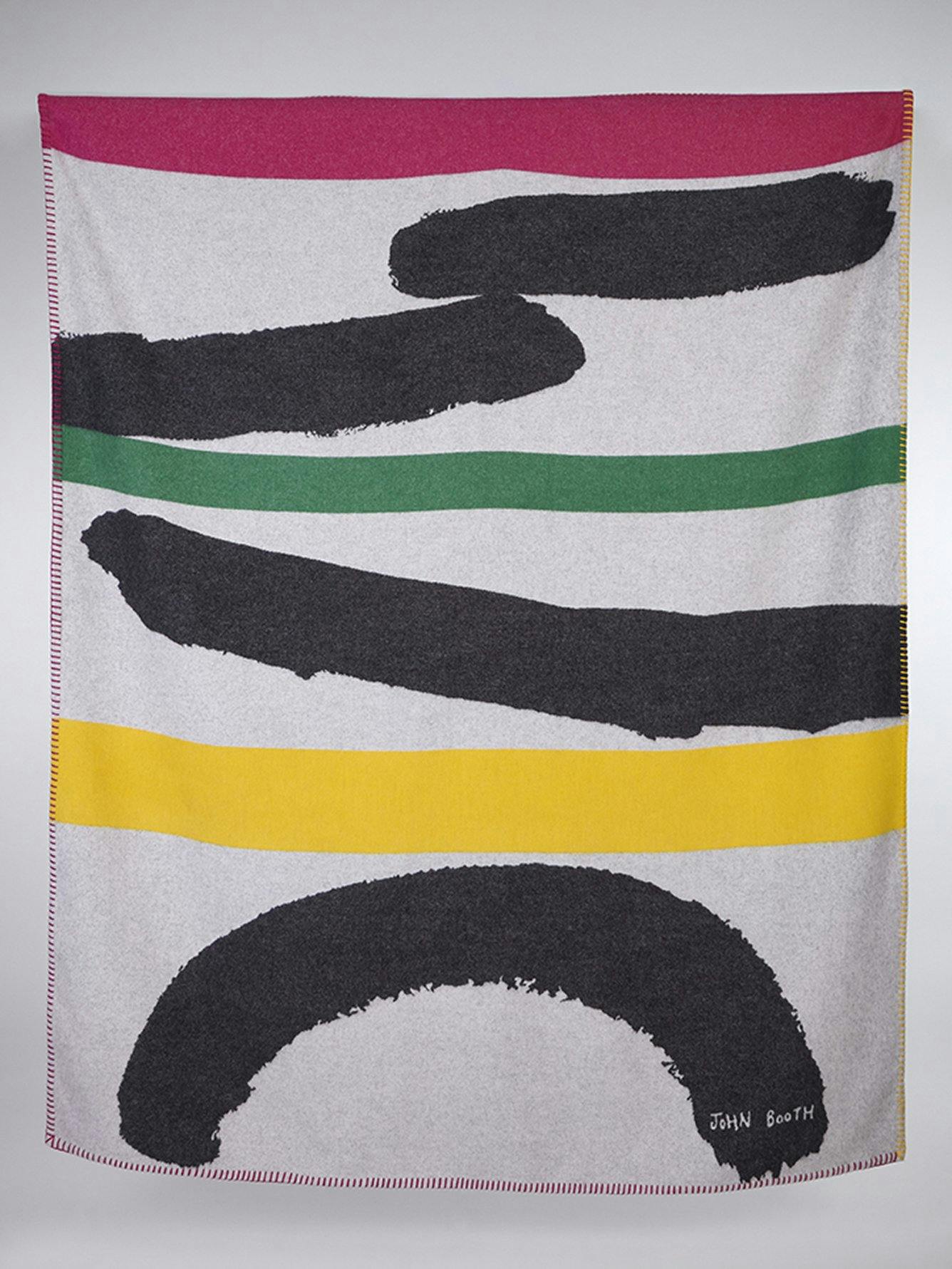
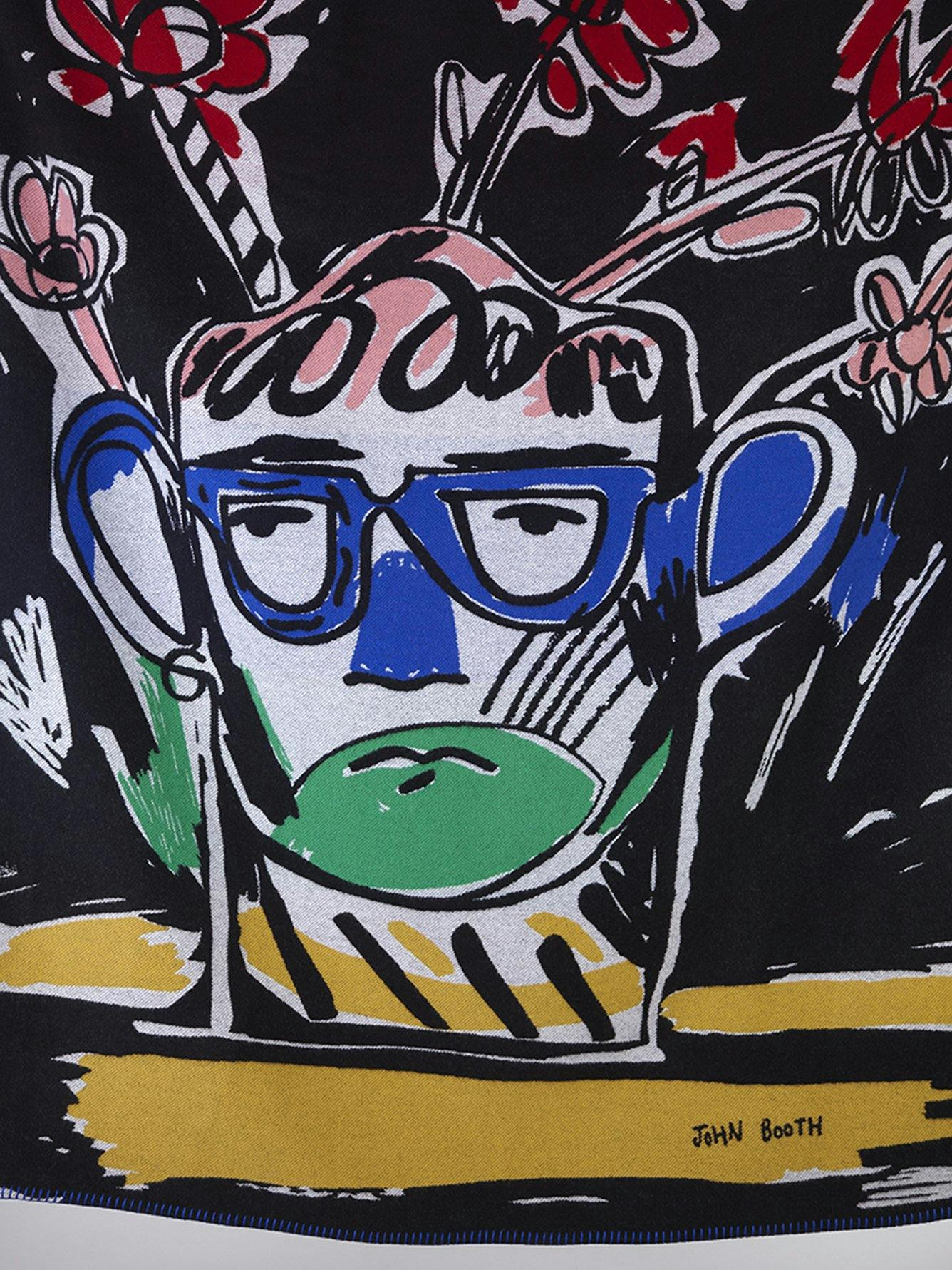
In recent years, the colour grey has become a widely recognised symbol of contemporary ‘good taste’. It’s a phenomenon that baffles Scottish-born artist John Booth, whose fearless use of vibrant, bold shades is central to his working practice and stems in part, from a childhood obsession with felt-tip pens and colouring-in books. We have again collaborated with John on a series of blankets for our Interiors collection for 2019. By visiting the mill in Scotland and working closely with the design team, John was able to experiment with Begg x Co’s textiles and expand on their rich offering by using two different themes for the collaboration; abstract decorative print and oral observation.
Since graduating from Central Saint Martins in 2009, you’ve worked with a number of prestigious brands including, Fendi, Lou Dalton, Ashish, John Galliano, Zandra Rhodes and Tate Galleries. As a self-confessed multidisciplinary artist, what is it about your work that makes the fashion houses gravitate towards you?
I grew up in the Lake District and was encouraged by both parents to be creative. This continued throughout my childhood and culminated in me moving to London to study Fashion Design with Print at CSM. I think it’s a fantastic industry to work in – the fast pace gives validation to the act of conveying a quick message as an artist. I think I’m approached by brands because my drawings work equally well as prints and as textiles. There’s something special about seeing your work in motion, instead of just being a static piece and it’s rewarding to work with companies like Begg x Co, because it enables me to produce the kind of products that I wouldn’t have the capacity to make alone. The quality of the craftsmanship at Begg x Co is amazing, which makes it even more fulfilling when you see your designs replicated to such a high standard.
Do you enjoy seeing your work across different mediums? Is it a good way to diversify your skills by testing out new formats?
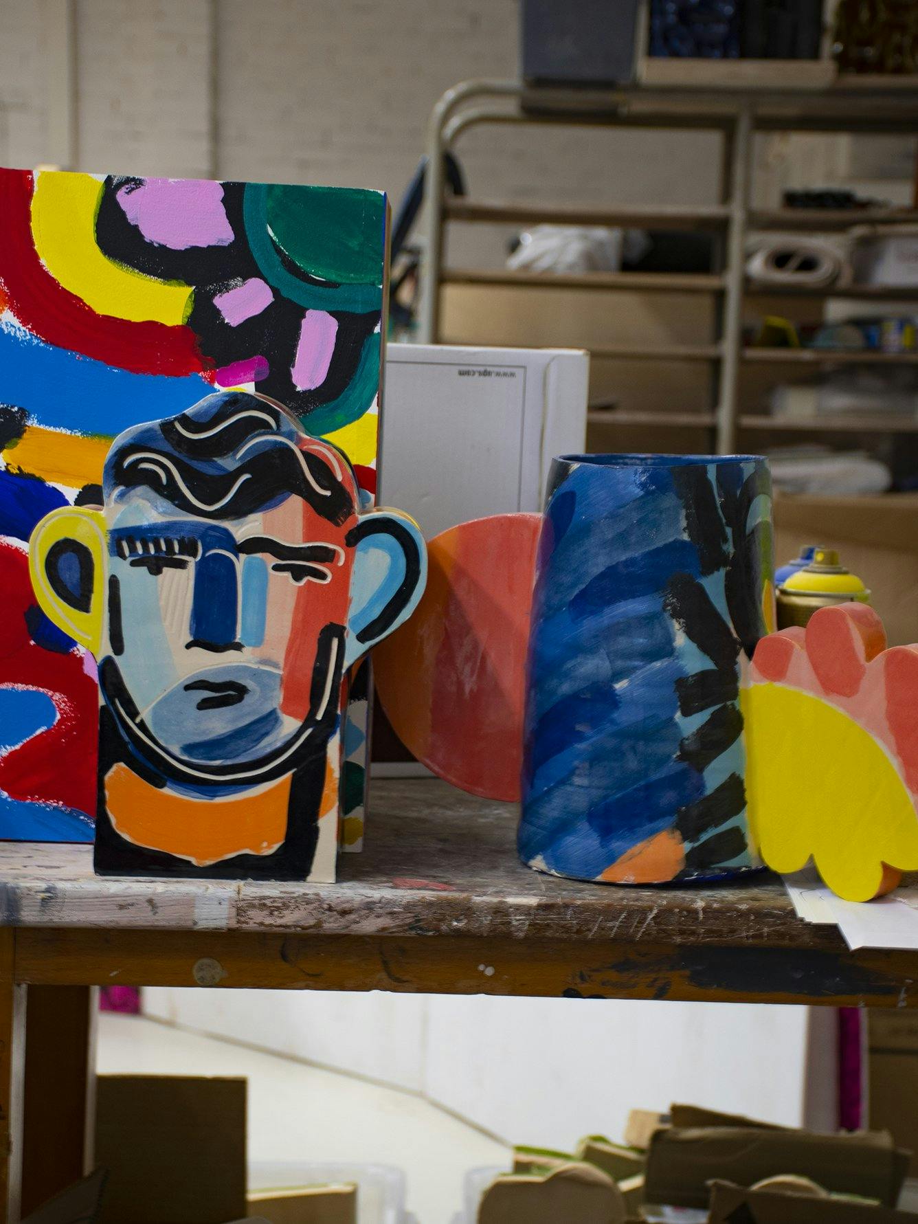
It gets progressively more and more interesting for me – it’s a real buzz, and I find myself getting a kick out of trying new materials and techniques. There’s a quote from David Hockney (who I love) who said, “I don’t mind boring you, but I wouldn’t want to bore myself!”. I think the same applies to me, because he’s talking about making work for yourself and enjoying what you do, without the constraints of worrying too much what other people might think about it. With the original Begg x Co brief, I was asked to create two florals, two paisleys and two check designs. I decided to make each one as a large-scale collage and I’m really pleased with how they turned out. Being given the freedom to work ‘big’ on something made the process of developing the ideas for the project a far more fulfilling experience. So for the blankets, I was really excited to be working with the Begg x Co team again, especially the designers. Being able to use yarn strings and swatches to decide on colourways gave me the opportunity to work with colour combinations I haven’t used in my ceramics before, and in particular, green. Also, being at the mill is incredible and allowed me to learn more about the different weaving techniques, like the contrasting whipped stitch edges on both blankets. The blankets are a true representation of my original artwork.’
When it comes to classic, timeless style, people very often steer towards softer, more neutral tones. Why do you think so many people are frightened of wearing bright colours?
A lot of people worry that bold colours are jarring and they feel wary of making a stand-out statement with busy prints or striking colour. Neutrals are perhaps easier to pull off – but they can also appear quite boring because they are in keeping with what’s considered as the quintessential version of ‘good taste’. When I think about some of the artists I’ve been most inspired by, there’s not a neutral in sight! Keith Haring, Ettore Sottsass, Nathalie du Pasquier, Betty Woodman…the list could go on, but even thinking about the television shows I’ve loved, like The Big Breakfast, The Word, Shooting Stars – they were all funny, full of colour and brought so much joy. There needs to be more joy in the world. When I designed my friend’s hair salon On The Floor London, there were no greys or neutral walls in sight!
You’re a huge fan of David Hockney. If you could time-travel back to the 1960s and be in artist in the era of pop-art, would you?
Absolutely not! I’m happy here and now. Alongside working at my studio, I also teach at degree level and find that I learn such a lot from the students, and I hope it works the other way around too. I love the energy of working in that environment and think the lecturing forms an important part of my practice. There are so many opportunities these days to share your work, which is one of the best things about being an artist in 2018. Positivity as a strategy – that’s my motto for life.
To shop the limited edition John Booth collection of bold, energetic and playful Wispy cashmere prints and blankets click here.


